A home that carries its homeland There are residences that solve a program and then there are residences that carry a family’s story. Jayashree’s Residence by VANZSCAPE Architects & Associates belongs firmly in the second category: a cozy 3000 SFT apartment in a posh locality of Hyderabad, conceived to reflect the family’s Rajasthani roots while …

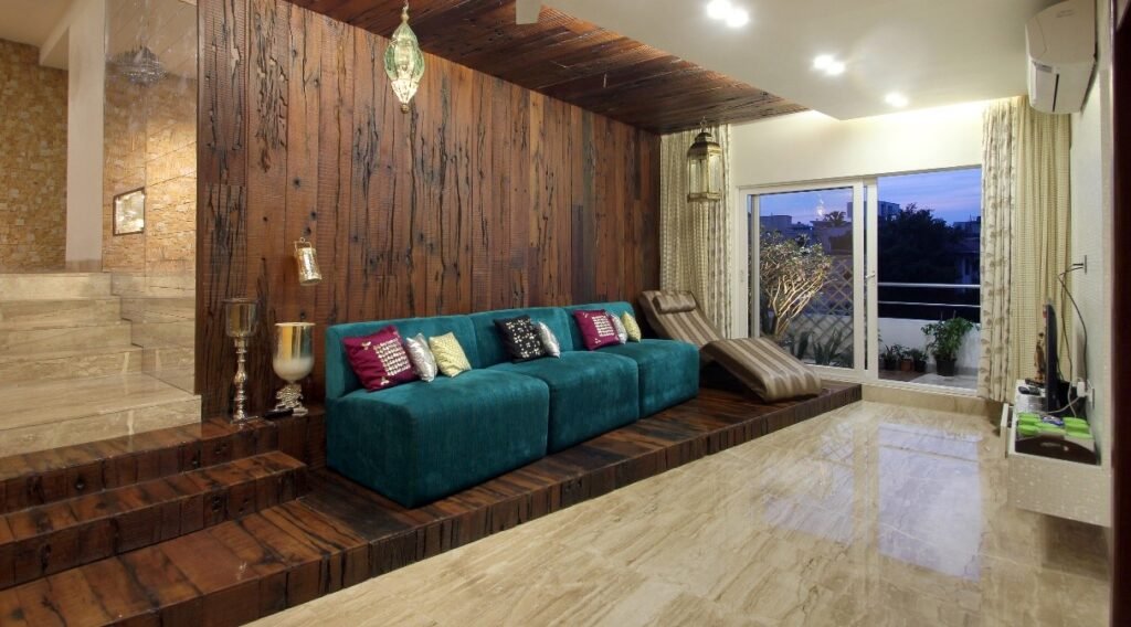
Table of Contents
- A home that carries its homeland
- Why “vernacular” matters more than ever in urban apartments
- The design concept: “Rajasthan, remembered Hyderabad, lived”
- Light as the primary material
- How does daylight move through the home from morning to evening, and how can the interior amplify it without glare?
- Air, comfort, and the invisible architecture
- Colour as memory, not decoration
- Texture: the bridge between craft and contemporary
- Foliage: landscape thinking brought indoors
- Stone from Rajasthan: authenticity that you can touch
- “Vernacular architecture” inside an apartment: what that can mean
- The “urban contemporary tinge”: restraint, clarity, and today’s life
- The real achievement: cohesion across senses
- Lessons designers can take from Jayashree’s Residence
- Closing: a contemporary home with a regional heartbeat
A home that carries its homeland
There are residences that solve a program and then there are residences that carry a family’s story. Jayashree’s Residence by VANZSCAPE Architects & Associates belongs firmly in the second category: a cozy 3000 SFT apartment in a posh locality of Hyderabad, conceived to reflect the family’s Rajasthani roots while remaining fully at ease in a modern, urban context.
The project note published by VANZSCAPE highlights a deceptively simple palette of intentions light, air, colours, textures, foliage, and stone from Rajasthan assembled to create a “vernacular architecture” sensibility tinged with urban contemporary design. That sentence is compact, but it opens up a rich conversation about identity in contemporary living: how do you translate a regional heritage often associated with havelis, courtyards, carved stone, handcraft, and desert light into an apartment typology shaped by elevators, slabs, and city views?
This article unpacks that design ambition: not by inventing room-by-room details that aren’t publicly documented, but by tracing the architectural logic embedded in VANZSCAPE’s stated approach and explaining how those ingredients typically become a coherent spatial experience.
Project snapshot
Project: Jayashree’s Residence
Type: Apartment / residential interiors (with landscape sensibility expressed through foliage)
Location: Hyderabad (posh locality
Area: 3000 SFT
Timeline: 2014–15
Design intent (as published): Reflect the family’s Rajasthani roots using light, air, colours, textures, foliage, and stone from Rajasthan creating vernacular architecture with an urban contemporary edge.
Why “vernacular” matters more than ever in urban apartments
In Indian cities, it’s common for families to live far from their region of origin while still carrying deep attachments to it through rituals, food, textiles, festivals, language, and the small domestic patterns that make a house feel like “ours.” Interior design often tries to address this with décor alone: a framed miniature painting, a few brass artefacts, a traditional rug. But vernacular architecture is not merely an aesthetic layer; it’s a system a way of dealing with climate, social life, thresholds, privacy, shade, and craft.
Rajasthan’s built traditions, for example, are famous not because they are ornate, but because they are performative: they shape light, filter air, create thermal comfort, stage processions of privacy, and celebrate material honesty. When a studio sets out to create a vernacular narrative “tinged with urban contemporary design,” the challenge is to translate those performative qualities into present-day constraints without turning heritage into theme décor.
Jayashree’s Residence, as described by VANZSCAPE, positions the project in this exact territory: heritage as lived performance, delivered through the fundamentals light, air, material, texture, foliage rather than a costume.
The design concept: “Rajasthan, remembered Hyderabad, lived”
A useful way to read VANZSCAPE’s published intent is as a two-part statement:
- Bring Rajasthan into the home through elemental cues (light, air, colour, texture, foliage, stone).
- Keep the home contemporary in function and expression a “tinge,” not a pastiche.
That second clause is critical. A “tinge” suggests restraint: you do not rebuild a haveli inside an apartment; you extract the principles that make the vernacular powerful and re-compose them using today’s construction realities and lifestyle expectations.
This kind of approach is aligned with VANZSCAPE’s broader practice positioning: designing spaces that respond to context, purpose, and people, balancing aesthetics with functionality and long-term value.
Light as the primary material
Rajasthan is often remembered through light: sharp sun, deep shade, reflective courtyards, filtered screens, and bright surfaces that bounce illumination into the depth of rooms. Translating that into an apartment typically begins with a simple but rigorous question:
How does daylight move through the home from morning to evening, and how can the interior amplify it without glare?
When a design brief explicitly includes “light,” it signals that illumination isn’t treated as an afterthought or only an artificial lighting plan it becomes a compositional tool.
In practice, this usually means a few strategic moves:
- Preserve clear daylight paths by reducing unnecessary visual clutter near openings.
- Use reflective or lightly textured surfaces that diffuse light rather than mirror it harshly.
- Balance bright planes with pockets of shade, so rooms feel layered and calm rather than uniformly exposed.
- Create “light moments” a deliberate highlight on stone, a glow grazing a textured wall, a soft wash on a niche so light becomes narrative.
The vernacular lesson here is not “make it bright.” The lesson is made light legible so occupants feel time passing, season shifting, and mood changing across the day.
Air, comfort, and the invisible architecture
The second element in VANZSCAPE’s own list air is easy to overlook because it is invisible. But in many vernacular traditions, airflow is architecture: it dictates opening placement, permeability, layering, and the choreography between public and private zones.
In a 3000 SFT apartment, “air” typically translates into:
- Cross-ventilation intent (even where partial), supported by internal planning that avoids sealing the home into isolated compartments.
- Breathable transitions spaces that are neither fully open nor fully closed, which allow air and people to move comfortably.
- Material decisions that reduce heat build-up: finishes that don’t trap warmth, fabrics that feel breathable, and surface choices that age gracefully in a lived-in climate.
Even without publishing technical details, the inclusion of “air” in the design narrative suggests the project is not only about looks it is about the lived physics of comfort.
Colour as memory, not decoration
If you ask people what Rajasthan “looks like,” colour is often the first answer: ochres and sand tones, deep reds, indigo, turquoise, and festive contrasts. But the most sophisticated use of colour is not to saturate everything it is to place colour where it carries meaning, and let it breathe.
VANZSCAPE explicitly lists colours as a core ingredient in building the home’s identity. In a contemporary apartment, that often implies a disciplined colour strategy such as:
- A calm base palette that supports daily living (especially in a compacted urban life rhythm).
- Concentrated colour moments perhaps in textiles, art, feature surfaces, or curated vignettes so regional references feel intentional rather than noisy.
- Warm–cool balancing, where Rajasthan’s warmth is tempered with modern neutrals to maintain an urban contemporary sensibility.
The point is not to “add Rajasthani colours.” The point is to make colour behave like cultural muscle memory: present, familiar, reassuring without demanding constant attention.
Texture: the bridge between craft and contemporary
“Texture” is where vernacular sensibility often becomes tangible. Rajasthan’s traditions are deeply tactile stone carving, lime plaster, timber details, patterned screens, handwoven textiles, metalwork, and layered surfaces that hold shadow.
VANZSCAPE names textures directly as part of the design method. In a modern apartment, texture becomes the safest and most authentic carrier of heritage because it doesn’t require literal replication of historic forms. Instead, it can work through:
- Relief and shadow (even subtle), giving walls and partitions depth.
- Handmade cues imperfections that communicate human craft rather than factory uniformity.
- Material transitions that feel deliberate: smooth adjacent to rough, matte beside softly reflective, crisp edges balanced by tactile softness in furnishings.
Texture is also how a home stays interesting over time. Trends fade quickly; tactile quality endures because it continually rewards attention in small ways especially when paired with light.
Foliage: landscape thinking brought indoors
One of the most distinctive inclusions in VANZSCAPE’s project note is foliage not “indoor plants” as styling, but foliage as part of the architectural toolkit. This aligns with VANZSCAPE’s broader identity as a studio spanning architecture, interiors, and landscape, with extensive landscape work referenced on its site.
When foliage is treated as a design ingredient (rather than a finishing touch), it typically serves multiple roles:
- Softening edges in hard-surfaced urban apartments.
- Improving perceived comfort, making rooms feel calmer and more restorative.
- Creating micro-thresholds, a plant cluster that gently separates zones without building walls.
- Adding seasonal rhythm, as plant growth and maintenance become part of home life.
- Echoing courtyard logic even when no courtyard exists by creating an “inner landscape” that anchors the home emotionally.
In the context of a Rajasthan-inspired narrative, foliage can also function as a counterpoint: the desert imagination meets the cultivated oasis. It becomes a poetic device especially in Hyderabad, where greenery is a familiar sign of comfort and status.
Stone from Rajasthan: authenticity that you can touch
Perhaps the most concrete statement in the published description is this: stone from Rajasthan is used as part of the project’s material expression. This is significant because it anchors the heritage narrative in a real, physical import something that is not simply “inspired by,” but materially connected.
Stone does a few powerful things in interior architecture:
- It carries time. Natural stone reads as enduring and calm, especially as it patinas.
- It carries geography. Even when occupants can’t name the quarry, they feel a place embedded in the home.
- It carries light. Stone’s surface whether honed, brushed, or textured modulates light in nuanced ways throughout the day.
Using stone from Rajasthan is also a disciplined move: it’s easy to overdo heritage motifs; it’s harder (and usually more successful) to let a single authentic material do heavy narrative work while the rest of the space stays contemporary.
“Vernacular architecture” inside an apartment: what that can mean
VANZSCAPE describes the result as a “vernacular architecture tinged with urban contemporary design.” In an apartment, that phrase can be interpreted as a set of spatial behaviors rather than a set of shapes.
Vernacular behaviors often include:
- Strong thresholds: a sense of arrival and decompression, even if the entry is small.
- Layered privacy: the home doesn’t reveal everything at once; it offers gradual discovery.
- Social clustering: spaces encourage togetherness, not just circulation.
- Climate sensitivity: light and air are moderated rather than merely admitted.
- Material honesty: finishes feel grounded, tactile, and regionally meaningful.
When these behaviors are executed with contemporary clarity clean detailing, functional planning, modern services integration the result can indeed feel like vernacular architecture without looking “old.”
The “urban contemporary tinge”: restraint, clarity, and today’s life
The phrase “tinged with urban contemporary design” is a quiet but decisive positioning.
It implies that:
- Functionality is non-negotiable.
- The home supports present-day routines work, school, hosting, rest without constant maintenance drama.
- Heritage elements are curated, not accumulated.
This is consistent with VANZSCAPE’s broader emphasis on creating spaces that respond to purpose and people, merging aesthetics with usability.
In practical terms, an “urban contemporary tinge” often shows up as:
- Simplified massing and lines, so the eye isn’t overwhelmed.
- Modern lighting discipline, using concealed illumination to elevate texture and stone.
- Controlled material count, where fewer materials are used more intentionally.
- Comfort-forward planning, so the home feels cozy (as the project note explicitly states) despite generous area.
The real achievement: cohesion across senses
What’s compelling about the way VANZSCAPE frames Jayashree’s Residence is that the “Rajasthan” story is not tied to a single element (say, a mural or a motif). It’s distributed across the senses:
- Seen through colour and light.
- Felt through texture and stone.
- Breathed through air and comfort.
- Lived through foliage and softness.
That kind of multi-sensory coherence is exactly what separates a culturally rooted home from a culturally themed interior.
Lessons designers can take from Jayashree’s Residence
Even from the brief public project description, there are clear, transferable lessons useful for homeowners and designers attempting culturally grounded modern homes:
- Start with elements, not motifs. Light, air, material, and texture carry culture more credibly than surface ornament.
- Use one or two “anchor authentics.” Rajasthan stone is a strong anchor; it allows other decisions to stay restrained.
- Let foliage do architectural work. Greenery can be spatial, climatic, and emotional not just decorative.
- Aim for a “tinge,” not a replica. The goal is a home that lives in today’s city while remembering where the family comes from.
- Make “cozy” a design outcome, not a styling trick. Comfort comes from calibrated light, breathable planning, tactile materials, and visual calm.
Closing: a contemporary home with a regional heartbeat
Jayashree’s Residence is described by VANZSCAPE in a way that feels both grounded and ambitious: a 3000 SFT Hyderabad apartment designed to reflect a family’s Rajasthani roots by composing the fundamentals light, air, colour, texture, foliage, and Rajasthan stone into a vernacular narrative refined by urban contemporary discipline.
In an era when “heritage” is often reduced to styling, this approach is more enduring: it treats culture as something the home does, not just something the home shows. And that is ultimately the highest standard for residential design creating spaces where identity is not displayed like a museum, but lived naturally, every day.