Color is one of the most powerful elements in design it can shape our perception, influence our mood, and define the character of a space more profoundly than any other visual component. As human beings, we are deeply responsive to color because it touches both our senses and our emotions. A right color can transform …
Color is one of the most powerful elements in design it can shape our perception, influence our mood, and define the character of a space more profoundly than any other visual component. As human beings, we are deeply responsive to color because it touches both our senses and our emotions. A right color can transform a room from dull to inspiring, from cold to welcoming, from lifeless to vibrant. It can elevate architecture, enhance proportion, and breathe personality into even the simplest of spaces. The choice and balance of colors, therefore, is not merely a decorative decision; it is an art form rooted in psychology, harmony, and intention. Designers and architects have long understood that beauty and comfort in a space are not achieved by extravagance, but by balance and balance in color is one of the most essential aspects of creating environments that inspire. Among the many principles that guide color harmony, the 60-30-10 rule stands out as one of the most timeless and effective. This simple yet profound concept offers a practical framework for achieving visual balance and emotional resonance in interiors and exteriors alike, proving that design excellence is often born from clarity and proportion.
To understand why color holds such transformative power, we must first recognize its psychological impact. Every color evokes specific emotions and associations. Warm colors like red, orange, and yellow stimulate energy, warmth, and excitement; cool colors like blue, green, and violet evoke calm, tranquility, and openness. Neutral tones white, gray, beige, and black create a sense of balance and sophistication. Our emotional response to color is both instinctive and cultural, shaped by nature and experience. The blue of the sky reassures us, the green of leaves comforts us, and the gold of sunlight invigorates us. When these colors are brought into our built environments, they carry with them these emotional associations. The right color palette can make a small room feel spacious, a dark corner appear light, or a chaotic space seem serene. Yet, while individual colors are powerful, their combination is what defines the true spirit of a room. This is where the principle of the 60-30-10 rule becomes essential it is not about choosing a single perfect color, but about orchestrating colors into a harmonious composition.
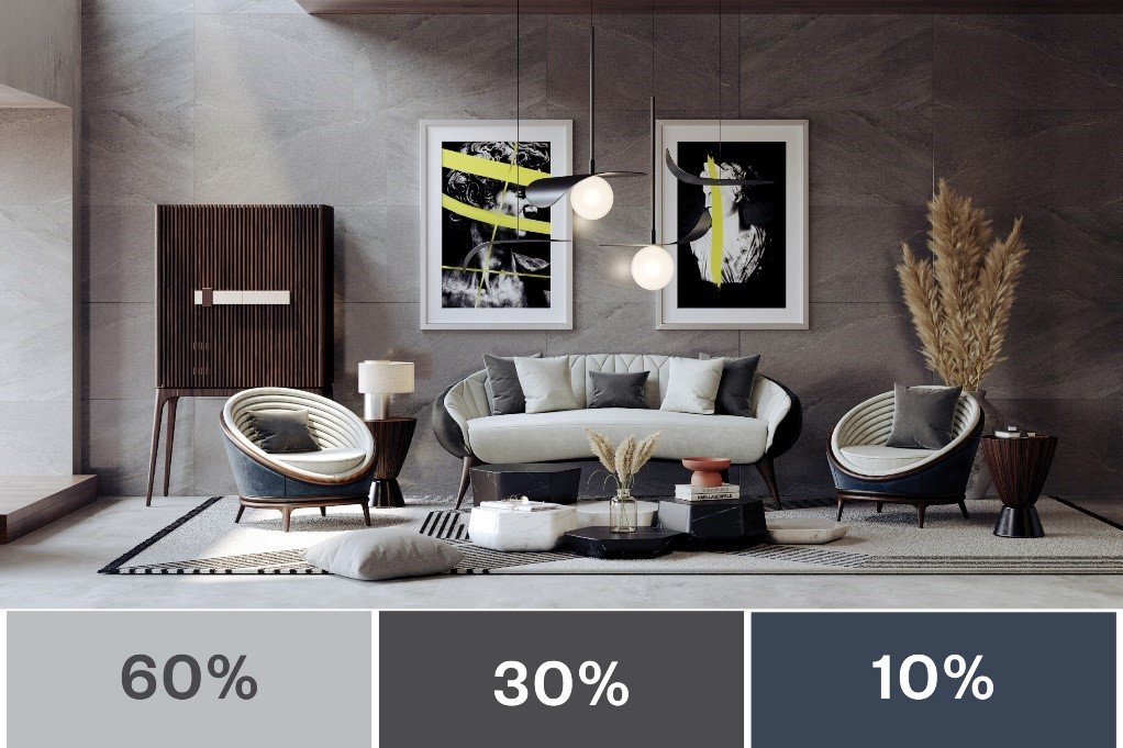
The 60-30-10 rule is a timeless guideline used by designers and artists to create balance and harmony in visual composition. The principle states that a well-designed color palette should consist of 60% dominant color, 30% secondary color, and 10% accent color. This ratio ensures visual stability, coherence, and interest. The dominant color establishes the foundation of the space it covers the largest surfaces, such as walls, large furniture, or exterior facades. The secondary color supports and enhances the dominant hue, often used in upholstery, rugs, or cabinetry. The accent color, limited to about ten percent of the total scheme, provides contrast, energy, and personality appearing in artwork, accessories, or small details. This proportion creates a natural visual rhythm, guiding the eye smoothly through the space without overwhelming it. The beauty of the 60-30-10 rule lies in its universality it can be applied to any color palette, any style, and any scale, from a cozy living room to an expansive building exterior.

Consider how this principle transforms interiors. Imagine a living room where 60% of the space is painted in a soft, neutral tone perhaps a warm ivory or cool gray. This dominant color establishes calm and unity. The 30% secondary color might appear in furniture upholstery, drapery, or area rugs perhaps a gentle sage green or muted navy to add depth and visual layering. Finally, the 10% accent color might be introduced through cushions, artwork, or vases in a vibrant mustard yellow or coral pink. The result is a space that feels balanced yet alive its tranquility anchored by the dominant color, its richness enhanced by the secondary tone, and its character illuminated by the accent. Without this thoughtful balance, the same room could easily feel monotonous or chaotic. The 60-30-10 rule transforms color selection from guesswork into a deliberate act of composition, much like a painter orchestrating hues on a canvas.
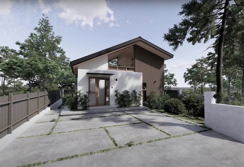
In exterior architecture, this principle is equally transformative. A building’s façade can express harmony and character through proportional color use. For example, a home exterior might use 60% of a soft neutral such as beige, stone gray, or off-white to cover the main surfaces. The 30% secondary color could be a darker tone used for shutters, trim, or columns perhaps charcoal or earthy brown creating visual structure and depth. The 10% accent might appear on the front door, window frames, or planters a pop of deep blue, red, or olive green that adds personality without overwhelming the design. This subtle orchestration of tones prevents a façade from appearing flat or overstated. It creates rhythm and focus, guiding the viewer’s eye and highlighting architectural details. The right combination can make a modest house look elegant, or an ordinary building façade feel sophisticated and memorable. Just as in interiors, the 60-30-10 rule provides a framework for proportionate expression, turning simplicity into artistry.
The principle’s effectiveness lies not in rigidity, but in the way it honors the natural balance of human perception. The human eye is drawn to contrast, yet it also seeks comfort in order. Too much uniformity creates boredom; too much variation causes confusion. The 60-30-10 rule mirrors the harmony found in nature where large fields of green grass (the 60%) are accented by patches of flowers (the 10%), and framed by the neutral sky or earth tones (the 30%). This balance between dominance, support, and emphasis is inherently satisfying because it aligns with how we perceive beauty in the world around us. It is, in essence, a visual translation of equilibrium.
Color, when used in the right proportion, also influences the perceived function of a space. In a home office, for example, a dominant tone of muted gray (60%) may encourage focus, while a secondary tone of deep blue (30%) can inspire calm concentration, and an accent of orange or yellow (10%) injects creativity and energy. In a bedroom, a soft pastel like dusty lavender or seafoam green might form the main palette, supported by creamy whites and a touch of metallic gold for luxury. In restaurants, hotels, or public spaces, the same principle applies but can be scaled for mood and brand identity earth tones for warmth and approachability, bold contrasts for excitement, or monochromes for sophistication. When a designer uses color thoughtfully, every surface becomes part of a narrative, every shade a note in the symphony of experience.
The emotional power of the 60-30-10 rule can be seen vividly in minimalist interiors as well. Minimalism often relies on simplicity, but simplicity without harmony risks feeling sterile. By using this color ratio, even minimal spaces can exude warmth and dimension. A predominantly white space (60%) gains richness when paired with warm wood tones (30%) and black or brass accents (10%). This combination creates depth and focus, allowing simplicity to become elegance. Similarly, in Scandinavian design a style celebrated for its clean lines and calm atmospheres the 60-30-10 rule is applied intuitively: white or light gray walls form the dominant base, natural wood provides warmth as the secondary tone, and splashes of color in textiles or art bring life to the room. The principle serves as a quiet guide, ensuring that simplicity never turns into emptiness.
The 60-30-10 rule also reveals that beauty in color is not about excess, but about restraint. It encourages designers to embrace discipline and intentionality. The rule prevents overuse of strong colors that could overwhelm a space, yet it also prevents monotony by reserving room for contrast. The accent color, though used sparingly, becomes the soul of the composition the note that lingers in memory. This idea is not limited to residential design; it extends to retail spaces, offices, and even urban environments. A city plaza, for instance, might use neutral paving stones and building materials as the 60%, greenery and furniture as the 30%, and art installations or signage as the 10% that captures attention. The same logic applies to branding and product design, proving that color harmony follows universal human principles.
When the 60-30-10 rule is applied skillfully, it also enhances spatial perception. Lighter dominant colors can make a space feel larger and airier, while darker secondary tones add grounding and definition. The accent color guides the eye, emphasizing architectural features or focal points. In this way, color acts as both an aesthetic and architectural tool it shapes how we experience form, depth, and proportion. A designer’s palette, therefore, becomes an instrument for sculpting emotion and space simultaneously. The transformation of a room from dull to inspiring is not a matter of luxury but of understanding this relationship between color, proportion, and perception.
Yet, while the 60-30-10 rule provides structure, creativity lies in how designers interpret it. Great design always allows for experimentation within principles. Some interiors may shift the balance using 70% neutrals and reducing the accent to 5% to achieve subtlety, while others might amplify the accent for vibrancy. The key is to maintain the relationship of dominance, support, and emphasis. This flexibility is what makes the rule timeless; it adapts to changing trends, materials, and cultural contexts without losing its essence. Whether used in a minimalist apartment, a rustic farmhouse, or a modern office, the concept remains universally relevant because it is based on human psychology rather than fashion.
In the realm of architecture and exteriors, color not only defines aesthetics but also conveys identity. Entire neighborhoods or cities can be shaped by thoughtful color composition. The pastel hues of Mediterranean towns, the earthy tones of desert architecture, or the bold contrasts of modern façades all follow a rhythm of dominance and accentuation. Architects often use the 60-30-10 principle to ensure visual coherence across large surfaces. For example, in a modern apartment complex, concrete or stone finishes might form the 60%, wooden panels or metal details the 30%, and brightly colored balconies or doors the 10%. This careful balance prevents visual clutter and creates a unified, elegant impression. The principle allows exteriors to express both order and personality qualities that define great architecture.
The transformative power of the right color combination can be felt emotionally the moment one enters a well-designed space. A dull, lifeless room can awaken with a balanced palette that speaks to its purpose. A kitchen painted predominantly in soft white (60%), complemented by light oak cabinetry (30%), and accented with black fixtures or green plants (10%) becomes bright, fresh, and alive. A corporate office that once felt cold can gain warmth through dominant neutral tones, supportive blues, and accents of warm amber. Even a small apartment can gain the illusion of openness through light walls and strategic pops of color. In every case, the transformation occurs not through expensive materials or complex designs, but through the thoughtful orchestration of color the most accessible and powerful tool in design.
Moreover, color harmony enhances well-being. Psychological research has shown that color affects not only our emotions but also our behavior and physiological responses. The right palette can reduce stress, increase productivity, or foster relaxation. The 60-30-10 rule supports this by creating balance neither overstimulating nor monotonous. It aligns with our innate sense of order, allowing the mind to feel settled and the body to feel at ease. This is why a right color composition does more than please the eye it uplifts the spirit.
In the end, the principle that “a right color can transform a room from dull to inspiring” speaks to a universal truth: beauty in design is not a luxury but a necessity for human fulfillment. Color is language it communicates emotion, identity, and atmosphere without words. The 60-30-10 rule is its grammar, the framework that turns chaos into clarity and randomness into rhythm. Through it, designers create spaces that resonate with balance, purpose, and grace.
To walk into a room balanced by this rule is to feel instantly at home not because it dazzles, but because it feels right. The eyes rest naturally, the senses harmonize, and the space becomes more than a visual experience it becomes an emotional one. Whether applied to interiors or exteriors, to homes or public buildings, the 60-30-10 rule embodies the timeless relationship between art and order. It reminds us that color, when guided by understanding, has the power to transform not only spaces but the people who inhabit them.
Thus, in every painted wall, every fabric, every door or detail, the story of transformation begins with one simple truth: when the right colors come together in the right balance, they turn the ordinary into the extraordinary. The 60-30-10 rule is not just a formula it is the expression of harmony itself. It proves that design, like life, is most beautiful when it finds its rhythm, its proportion, and its perfect balance between calm and energy, foundation and expression, the dominant and the accent the harmony that transforms dullness into inspiration and space into soul.