Introduction: the airport road as a city’s first handshake In contemporary Indian cities, the airport road has quietly become one of the most influential public spaces, even though most people experience it at speed. It is the first slice of the city for visitors, investors, delegates, and returning residents. It is also the last memory …
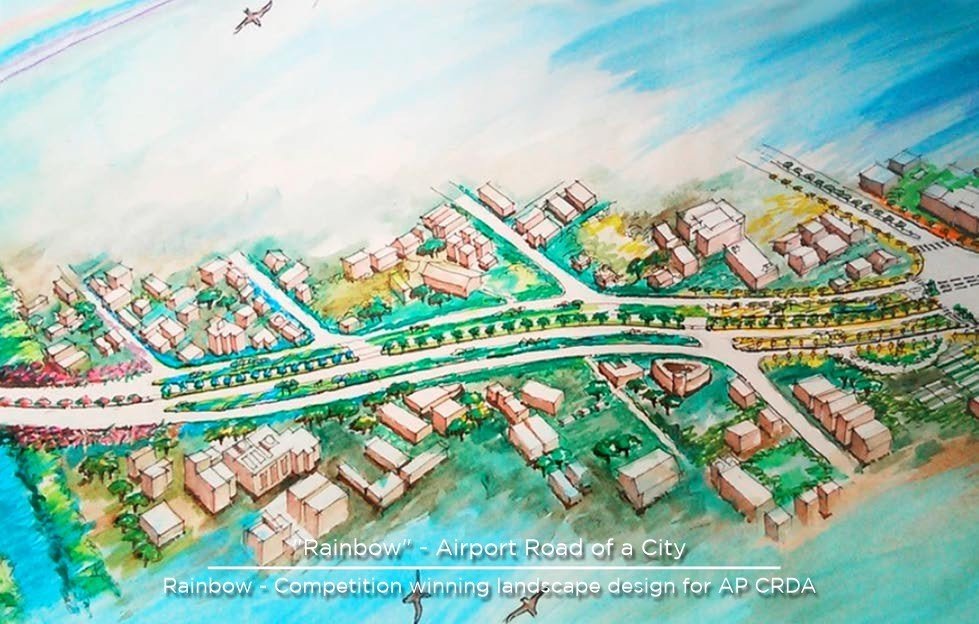
Table of Contents
Introduction: the airport road as a city’s first handshake
In contemporary Indian cities, the airport road has quietly become one of the most influential public spaces, even though most people experience it at speed. It is the first slice of the city for visitors, investors, delegates, and returning residents. It is also the last memory people carry when they leave. That makes the airport corridor more than infrastructure. It is a brand statement, a psychological transition, and a test of how a city chooses to present itself.
VANZSCAPE’s “Road to Capital City” project in Vijayawada, dated 2016–17 in the firm’s published narrative, addresses exactly this moment of arrival. The core idea is both simple and ambitious: use a “rainbow concept” to develop and beautify the connecting airport road of Vijayawada, treating the airport as a modern-day gateway to a city, and using colour as a unifying language.
But the most interesting part of the narrative is not just that the road is colourful. It is why the colours exist. VANZSCAPE describes selecting each colour to represent a region, weaving a rainbow out of different hues. Each hue is intended to emotionally connect to the characteristics of people in that region, while still reading as part of a composite whole, forming a soft, radiant rainbow.
That is a powerful urban design proposition. It shifts streetscape design away from decoration and toward meaning. It also suggests a disciplined design approach because a rainbow can easily become chaotic if it is applied without hierarchy, rhythm, or restraint.
This blog elaborates on the project idea and what it typically implies at the scale of an airport corridor: how colour becomes a system, how identity is translated into public realm elements, how high-speed perception changes design decisions, and how a linear urban landscape can be made memorable without becoming visually noisy.
Project snapshot
- Project: Beautification of Road to Capital City, Vijayawada
- Timeframe indicated by VANZSCAPE: 2016–17
- Design concept stated: rainbow concept for the connecting airport road, using colours to represent regions and form a composite whole
- Primary intent stated: treat the airport road as a modern-day gateway to the city and create an emotionally resonant identity
Why an airport corridor is the right place for a big idea
Most urban beautification projects focus on plazas, lakes, parks, or heritage precincts. Those are important, but they tend to serve local users. An airport corridor serves everyone, and it compresses the city’s identity into a single, legible sequence.
An airport road has four characteristics that make it uniquely powerful for placemaking:
1) It is experienced repeatedly by high-impact users
Business visitors, government officials, conference delegates, and investors often see the airport road multiple times within a short trip. Even if they do not “use” public space in the conventional sense, they absorb cues about governance, cleanliness, discipline, and aspiration.
2) It carries the emotional weight of arrival
The airport road is where anticipation begins. People are fresh, attentive, and often more sensitive to atmosphere than they are deep inside the city’s everyday traffic.
3) It is a long, linear canvas
Unlike a plaza, which can rely on density and pause, a corridor must rely on rhythm and repetition. That pushes designers toward systems rather than one-off gestures.
4) It is judged at speed
Design for a corridor is not design for a slow stroll. It is design for 40 to 80 km/h perception. Elements must be bolder, clearer, and more coherent to read properly.
In that context, the choice of a rainbow concept is strategically appropriate. A rainbow is inherently legible from a distance, understandable without explanation, and emotionally positive across cultures. The design challenge is to translate that symbol into real, buildable streetscape components that still perform under heat, dust, monsoon, maintenance cycles, and night lighting.
The rainbow concept as a civic framework, not a colour splash
VANZSCAPE’s description makes it clear that the rainbow is not simply a visual effect. It is a framework for representing regional diversity while reinforcing unity. The hues are meant to connect emotionally to the characteristics of people from each region, yet remain part of a composite whole.
That idea mirrors a fundamental principle of city identity: cities are composites. They contain multiple communities, histories, and aspirations. A single colour cannot represent that complexity. A system of colours can, if it is handled with discipline.
To make a rainbow operate as an urban framework, three design principles typically become essential:
1) Hierarchy
Not everything can be colourful. If every surface shouts, nothing is heard. A strong rainbow strategy uses a neutral base, then deploys colour selectively as accents, bands, nodes, and focal elements. The neutral base is what allows colour to feel intentional, soft, and radiant rather than loud.
2) Rhythm
A corridor needs pacing. Colour can supply that pacing by repeating at consistent intervals, intensifying at key nodes, and easing between them. This creates a mental map for travellers: you begin to sense progress and proximity through the repetition of cues.
3) Continuity
If each segment is designed independently, the corridor becomes a collage. The “composite whole” concept implies continuity: consistent detailing, repeated materials, stable proportions, and an overall palette logic that ties the sequence together.
A rainbow is most convincing when it feels inevitable, as if it could only have been composed that way.
The airport as a modern-day gateway
VANZSCAPE explicitly states the airport is a modern-day gateway to a city. That single sentence is a reminder that gateways have always been central to urban identity. Historically, cities marked entry through walls, gates, ceremonial streets, and thresholds. Today, the airport and its connecting road play that role.
Designing a gateway corridor typically requires thinking in three zones:
1) The first threshold: leaving the airport campus
This is where the city introduces itself. The design tends to be more formal and controlled, because it sets expectations. It is also the zone where wayfinding clarity is critical.
2) The middle journey: building the narrative
This is where rhythm matters most. The landscape and streetscape need to prevent monotony, manage the scale of open road, and deliver a sense of progression. Colour can become the narrative thread.
3) The arrival edge: approaching the city and the capital corridor
This is where intensity can increase again. Visual cues can become richer, not necessarily louder, but more layered. It is also where the corridor begins to interact with urban activity, junctions, and development edges.
The rainbow concept can unify all three zones by acting as the signature thread, while still allowing the spatial experience to change across the journey.
How colour becomes built form in a road beautification project
Colour in public realm design is not paint alone. In a corridor landscape, colour typically appears through a mix of durable, maintainable elements. When done correctly, it remains stable across seasons and weathering.
A rainbow corridor can be expressed through several categories of design components:
1) Median landscapes and planting composition
Medial strips are some of the most visible surfaces on a corridor because they sit in the central field of view. A rainbow strategy here could work through flowering cycles, foliage tones, and layered planting that suggests bands of colour.
The key is to avoid fragile planting palettes that collapse under heat or maintenance gaps. A robust approach usually combines hardy structural planting with seasonal colour highlights, so the corridor remains coherent even when some plants are between cycles.
2) Hardscape bands and paving accents
Paving can carry colour through inlays, bands, or textured segments, especially in zones where vehicles slow down, such as junctions, crossings, service roads, or bus bays. On high-speed lanes, paving colour should be used with caution, because it can create glare or visual noise if overdone.
3) Street furniture and micro-architecture
Elements like benches, bollards, railings, sign frames, and shelters can carry the colour palette in a controlled way. This is often the most maintainable method because components can be replaced individually without reworking the landscape.
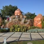
4) Sculptural markers and node features
Roundabouts, major junctions, and entry nodes can carry a stronger concentration of the rainbow idea. This is where the concept can become iconic, allowing photography, recognition, and memory formation.
5) Lighting as the second identity layer
A corridor changes character in the evening. Lighting can reinforce colour in a refined way, particularly through controlled illumination on landmarks and selective washes on landscape features. The goal is to keep the corridor elegant, not festive in a temporary way.
Because VANZSCAPE describes the rainbow as “soft” and “radiant,” the implied design language is not carnival-like. It suggests controlled saturation and careful calibration, where colour reads as warmth and identity, not as clutter.
The design discipline of “soft radiant”
The phrase “soft radiant rainbow” is worth unpacking because it signals restraint. In public projects, especially along roads, there is a constant temptation to make features louder to prove impact. But loud does not equal memorable, and it often ages poorly.
Soft radiance in a corridor typically comes from:
- Using a neutral base palette for most surfaces
- Deploying colour as a repeated motif rather than a one-time graphic
- Selecting hues that harmonise rather than clash
- Using matte or textured finishes where possible to reduce glare
- Balancing colour with greenery so the corridor still feels like landscape, not a painted object
- Creating gradients or transitions between hues so the rainbow feels woven, not segmented
This is the difference between a road that looks “decorated” and a road that looks “designed.”
/Representing regions through colour without stereotyping
VANZSCAPE’s description speaks about choosing each colour to represent a region and connect emotionally to the characteristics of the people of that region. That is an ambitious intention, and it must be handled responsibly.
In practical design terms, representing regions through colour works best when it avoids simplistic stereotypes and instead focuses on shared cultural cues that are broadly recognisable. Colour can be tied to:
- landscape cues such as earth tones, coastal blues, forest greens
- craft traditions such as textiles, local art palettes, festival colours
- agricultural cycles and seasonal landscapes
- architectural heritage tones such as stone, terracotta, lime, or painted surfaces
- civic identity elements already present in regional symbolism
The strength of a rainbow concept is that it can hold many references without needing literal representation. Colour is abstract enough to avoid reducing culture to icons, while still carrying emotional associations.
The corridor as a moving gallery
When a road beautification project is concept-led, it effectively turns the commute into a curated experience. The traveller becomes a viewer, and the corridor becomes a moving gallery.
That requires thinking in scenes rather than objects.
A corridor gallery typically includes:
Long views
These are the stretches where the eye scans far ahead. Here, the rainbow should appear as broad, legible bands, not as small details. Planting masses and repeated structural elements work best.
Mid-range moments
These happen at moderate speeds or where the road bends slightly. Here, the concept can show variation and layering, such as alternating colour accents or secondary patterns.
Close-up nodes
These occur at junctions, U-turns, signals, and entries where vehicles slow. Here, detail can become finer. Pavement inlays, signage detailing, and furniture become visible.
By designing across these three scales, the corridor stays engaging without becoming exhausting.
Safety and performance: the non-negotiables of road beautification
A common misconception is that beautification is purely aesthetic. Along roads, design must serve safety first.
A robust corridor design typically addresses:
Sightline integrity
Planting and features must not block driver visibility, especially near junctions, curves, and merging zones. Any vertical elements need careful placement.
Glare and reflectivity control
Certain bright finishes can create glare, especially under intense sun. A soft radiant palette suggests finishes that are not overly reflective.
Maintenance safety
Median access, pruning routines, irrigation repairs, and lighting maintenance must be possible without creating dangerous working conditions. This often drives choices about planting density and material detailing.
Night readability
Lighting should reinforce edges, crossings, and nodes. Colour lighting should not reduce visibility or confuse traffic signals.
In high-speed corridors, the best design is the one that feels effortless. Users should not need to interpret it. They should simply feel that the city is cared for.
Landscape infrastructure: drainage, dust, heat, and durability
A corridor landscape in coastal Andhra conditions, and more broadly in south Indian climates, must handle heat, dust, and monsoon bursts. This shapes what is possible, regardless of concept.
A rainbow corridor that lasts typically integrates:
Stormwater logic
Planting beds and medians can be shaped to manage runoff, reduce erosion, and prevent waterlogging that destroys plants and paving. Drainage integration is especially important near underpasses and junctions.
Dust resilience
Road corridors accumulate dust quickly. Species selection and finish selection must tolerate dust without looking perpetually dirty. Materials that show every stain or scratch should be used sparingly.
Heat mitigation
Shade is limited along wide corridors. Trees, where feasible, can reduce surface temperatures and improve perceived comfort, especially for pedestrians in service road zones.
Irrigation realism
If the planting concept relies on high-water species, the corridor becomes expensive and fragile. A robust approach uses hardy species and concentrates irrigation where it has the most visual return.
The rainbow concept can be reinforced through planting, but it must be done with species that survive, otherwise the identity disappears within a few seasons.
Wayfinding and identity: colour as an orientation tool
One of the most underutilised benefits of colour systems in public realm design is wayfinding.
A colour-coded corridor can help users in subtle ways:
- distinguishing segments of a long road
- signalling proximity to key junctions and destinations
- creating recognisable meeting points
- improving the clarity of service road connections and crossings
- supporting event signage and temporary guidance systems
In the context of a “road to capital city,” this becomes even more valuable. The corridor is not just moving people. It is moving first-time visitors who may be unfamiliar with the city. Colour can quietly reduce friction and make navigation feel intuitive.
The emotional brief: designing for connection, not just movement
VANZSCAPE’s narrative emphasises emotional connection to people’s characteristics and a composite whole. That signals a human-centered ambition: use design to make infrastructure feel like it belongs to the people, not merely to vehicles.
In corridor projects, emotional connection is often built through:
- recognisability, so people can say, “this is our city’s gateway”
- consistency, so the corridor feels maintained and intentional
- moments of delight, such as a striking colour transition or a landmark element
- public pride, where the corridor becomes something residents show visitors
- symbolic coherence, where the concept is understandable without reading a plaque
A rainbow is a particularly effective connector because it is universally associated with optimism after rain, diversity, and hope. Translating that into an airport corridor is a statement that the city sees itself as plural, welcoming, and forward-looking.
What this project represents in VANZSCAPE’s broader portfolio logic
From VANZSCAPE’s own published journey narrative, the Road to Capital City beautification sits in a phase where the practice is engaging with large public-facing landscapes and identity-driven environmental design, alongside projects like golf landscapes and riverfront rejuvenation.
The throughline is not style. It is concept. In each of these projects, the firm’s public descriptions foreground a single guiding idea, then translate it into spatial experience. For the Vijayawada corridor, that idea is a rainbow woven from regional hues into a composite whole.
That is a useful model for public projects because it gives stakeholders a clear story while still leaving room for technical discipline.
Practical lessons for public realm designers and city agencies
A corridor identity project like this suggests several actionable lessons for similar commissions:
1) Anchor the design in a single, legible narrative
The rainbow concept is easy to communicate and difficult to misinterpret. That makes approvals, coordination, and public acceptance smoother.
2) Build a system, not a collection of features
Linear projects demand repetition, hierarchy, and standard details. That is how a corridor stays coherent over time.
3) Calibrate for speed
Design for how the corridor is actually experienced. Bold moves at long distance, detail at slow nodes, and continuity everywhere.
4) Treat maintenance as part of the design
Planting palettes, material selections, and lighting strategies must match the operating reality of civic agencies.
5) Let identity support function
Colour can do more than decorate. It can guide, orient, and structure memory.
Closing: a gateway that celebrates diversity and unity
VANZSCAPE describes the Road to Capital City beautification in Vijayawada as a 2016–17 effort using a rainbow concept to develop and beautify the connecting airport road, treating the airport as a modern-day gateway, and selecting colours to represent regions that emotionally connect with people while forming a composite whole.
That idea is particularly appropriate for an airport corridor because it is both symbolic and practical. Symbolic, because it presents the city as a plural, welcoming composite. Practical, because it creates a legible identity across a long linear road that must be read at speed.
In the end, the value of such a project is not only that it looks better. The value is that it gives a city a clearer first impression, a stronger sense of pride, and a gateway experience that feels designed, not accidental.